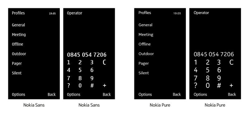
Let's face it, a lot of users, including us, thought the default Symbian Nokia sans font looked tired and archaic, and contributed a large deal to the general dislike of the platform. After announcing they will do a complete revamp of the interface by the fall, the Finns are obviously focused on uprooting the font nuisance as well.
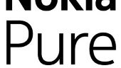
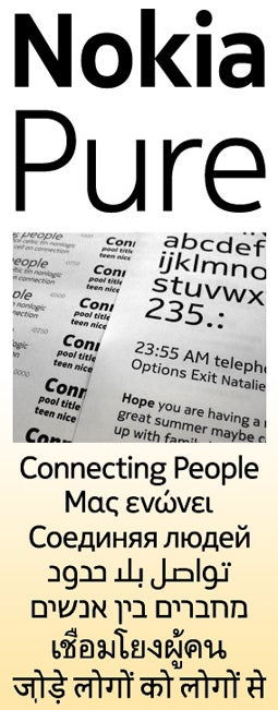
Nokia Pure is being developed by a London typography and design house to be the new corporate font of the company. We will see it in marketing materials, as well as on manufacturer's phones, but it is unclear and probably unlikely this will include Nokia Windows Phone, as this one already has its own minimalistic font to marvel at.
Rather this has to be viewed as a sign of a larger effort to change the image and vision of Nokia on its way to regain what it lost after Apple disrupted the smartphone biz in 2007 with the introduction of the iPhone, and then Google followed suit with Android.
And it's very often the little details that make a big difference in perception. The director of brand and marketing for Studio Nokia says about the font:
"Nokia Pure is a celebration of our Finnish design heritage. We wanted to give it a natural, flowing form, while creating something that is highly functional and neutral. Nokia Pure has a clarity of purpose and as little design as possible. It’s made to celebrate human creativity."
Sounds great, now it's time to apply this creativity to Nokia's upcoming phones, and we are sold. Do you like what you are seeing in Nokia Pure?
A discussion is a place, where people can voice their opinion, no matter if it
is positive, neutral or negative. However, when posting, one must stay true to the topic, and not just share some
random thoughts, which are not directly related to the matter.
Things that are NOT allowed:
Off-topic talk - you must stick to the subject of discussion
Offensive, hate speech - if you want to say something, say it politely
Spam/Advertisements - these posts are deleted
Multiple accounts - one person can have only one account
Impersonations and offensive nicknames - these accounts get banned
Moderation is done by humans. We try to be as objective as possible and moderate with zero bias. If you think a
post should be moderated - please, report it.
Have a question about the rules or why you have been moderated/limited/banned? Please,
contact us.


Things that are NOT allowed: